Client
Microsoft
My Role
UX Design
The Project
I worked on the UX team when we implemented a complete UX/UI overhaul of Outlook Web Access. The team consisted of UX researchers, UI designers, Prototypers, Front-end designers, and Management. I worked as a floating UX designer going from project to project wherever the team needed help. Since this was a complete bottom-to-top build there was a lot of work that needed to be done. I specifically worked on a lot of UX framework designs & decisions, writing technical specs, researching and developing the touch States, and animation/timing for the mobile experiences for the app.
The Approach
We approached this major project with a complete bottom-to-top teardown and build-up. Since we were taking a product that had never had a mobile design before and also had a lot of moving parts, the planning stage was crucial. We first started with days of whiteboarding and planning. We then started the design process with basic wireframes of the mobile experience first (as that had the least real estate to work with). We teamed up with the UX researchers and ran very early user studies to determine the content and navigation and hierarchy of the app.
After that stage, we moved into the skinning process taking the basic wireframes and starting to flesh out design ideas and decisions into the wireframes. The UI team developed the design language and met the UX team in the middle with design guidelines that we then rolled into high-fidelity mockups. We were testing the design decisions with users the whole time and pivoting our designs based on the user feedback. This was a very agile and collaborative process that lasted a year ending with the product shipping after half a year of development.

Wireframe Rounds
We worked in a very agile and iterative environment working quickly to produce screen variations. Since we were basically redesigning the structure and layout of a product that the public has such an intimate relationship (email) with we had to make sure we got it right. The wireframing rounds lasted a good 6 months. We had many screens to design for at the time (Desktop, Tablet, and Mobile) which meant many opinions and decisions had to be made. We would design screens, put them in front of users in a research study, gather feedback, adjust designs, and then present them to stakeholders.
-
![]()
DESKTOP INBOX EARLY WIREFRAME
-
![]()
TABLET INBOX EARLY WIREFRAME
-
![]()
MOBILE INBOX EARLY WIREFRAME
-
![]()
BASIC MOBILE FUNCTIONALITY WIREFRAMES AND FRAMEWORK
-
![]()
NEW WIREFRAME LAYOUT WITH UPDATED LOOK


Annotations and Design Specs
After the UI team had wrapped the final wireframes in updated designs I would take the files and make annotations and design specs to hand off to the dev team. I would then follow up with the dev team to make sure everything made sense and that the design was getting implemented correctly.


Getting closer to launch, it started to become real. There were several iterations of feature layout options we produced so when the time came to launch we would be ready with options.
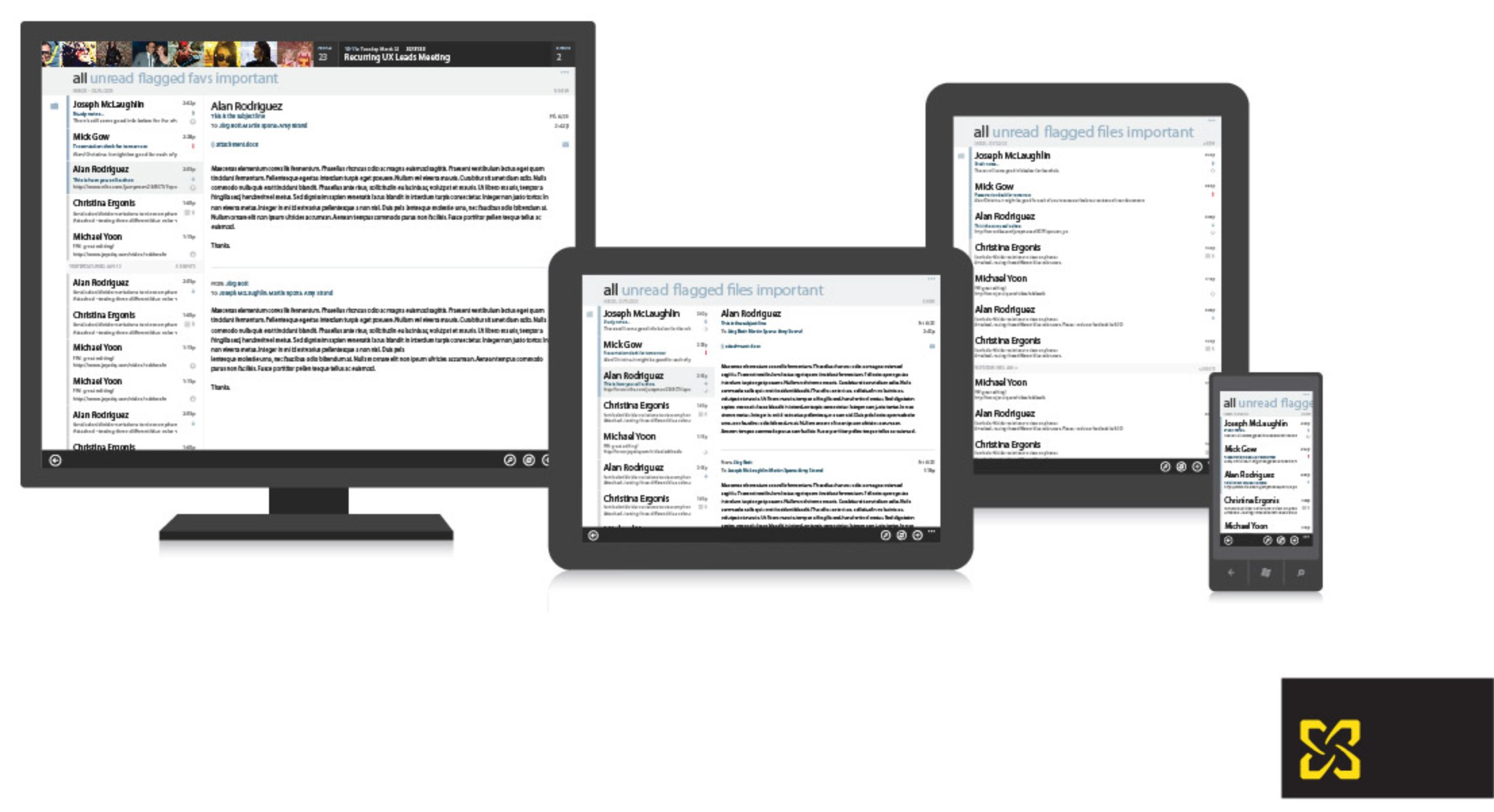
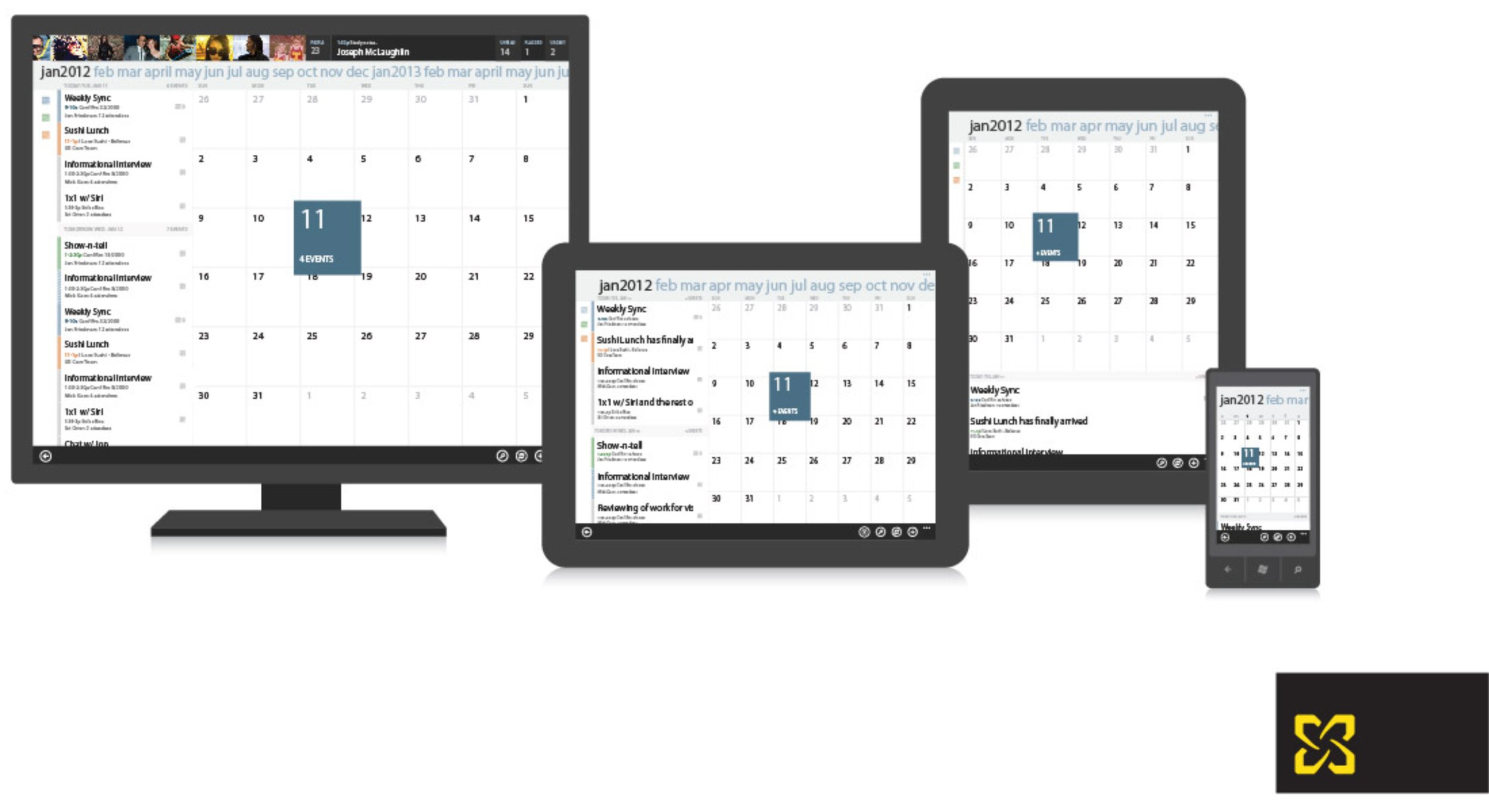
Final Design Comps


Design system

Final Designs
The Results
Product shipped on time
Design and product eventually got integrated into Office 365