Client
Verizon Wireless
My Role
Art Director
Lead Design
The Project
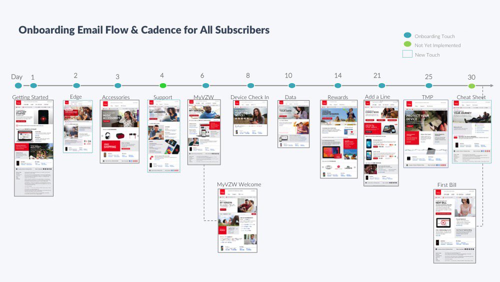
Verizon Wireless customers receive a series of emails during the first 30 days after they purchase, upgrade or add a new device to their account. By focusing on educating the customer about their device and other services, like My Verizon, we’re able to provide the customer with a pleasurable, and most importantly, useful experience. The ask was to simplify the customer’s onboarding process and make it more productive for them in fewer steps.
The Approach
I set out to develop a flexible UX/UI and strategy for this very complex, highly dynamic, and personalized landing page for Verizon Wireless customers in the Onboarding series. The landing page talks to the customer’s data which in turn influences the content that is displayed on the landing page. This page compiles all the data and information in one place for the customer to take action without leaving the landing page experience. This high-priority project had myself and my team working with internal Verizon stakeholders and developers across divisions.
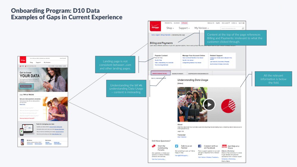
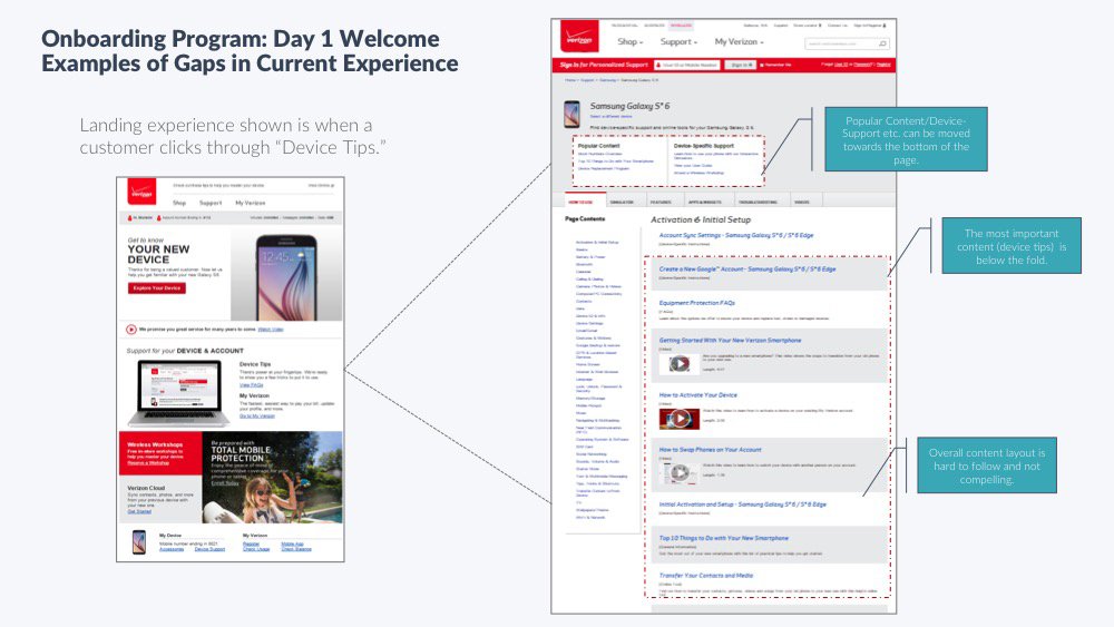
The approach myself and my team took was to go through every email communication a customer would receive in the onboarding and do a content audit. This included following all links and documenting landing page experiences. Through this process, we discovered a total of 4 separate landing pages where customers were to take some action (i.e. sign up, log in, register, etc). With this process and documentation in place, we uncovered opportunities to streamline and simplify the landing page experience all around. Below you will see the onboarding email program followed by the old landing page experiences and documentation.
Wireframe Rounds
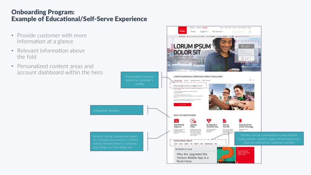
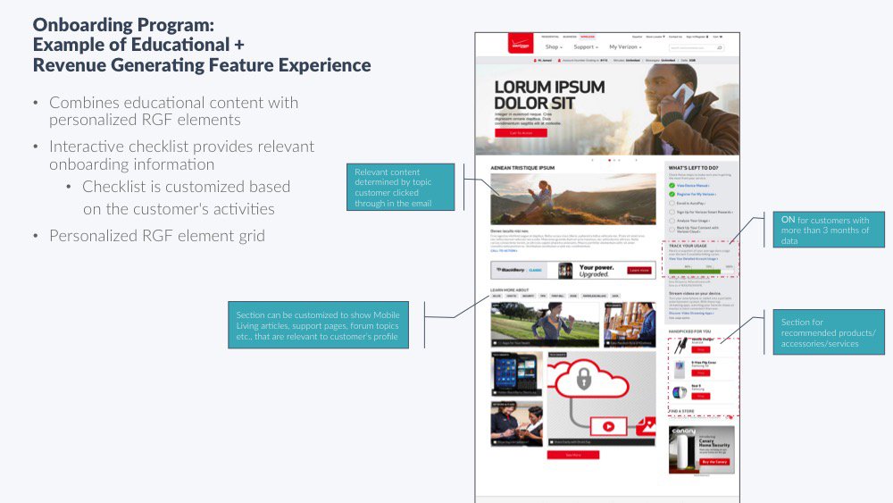
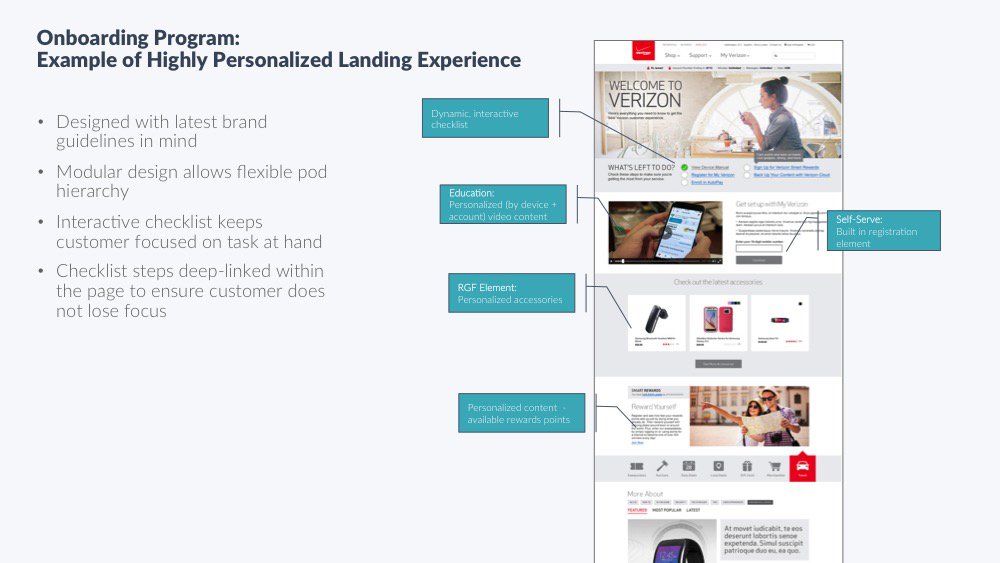
At this stage, we started to produce rough wireframes to vet some ideas. I had the designers and myself break off and come up with their own concepts, based on the content audit and business requirements. We then walked through the concepts and decided to pursue 3 versions: An educational self-serve, educational + RGF, and a highly personalized combination landing experience.
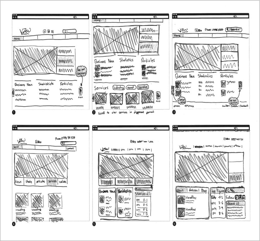

We were initially tasked with creating 2 concepts with the KPI’s in mind but after going through our process we found an opportunity to push the boundaries and created a 3rd version, a kind of pie in the sky version.
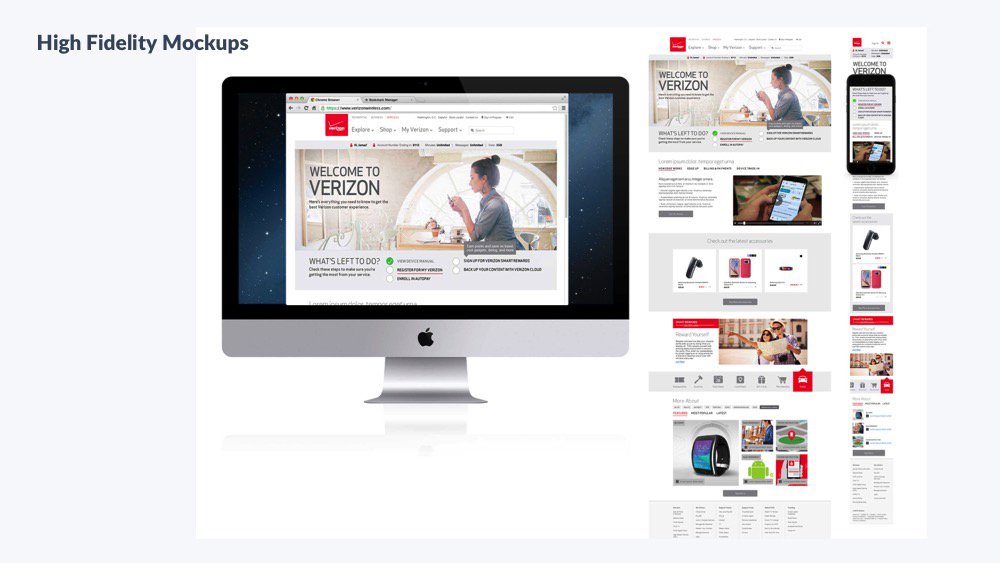
Final Design Comps
Design Specs
The client chose to invest and sign off on the highly dynamic, personalized landing page. Even though this would push the timeline back due to development, it was ultimately the right choice.
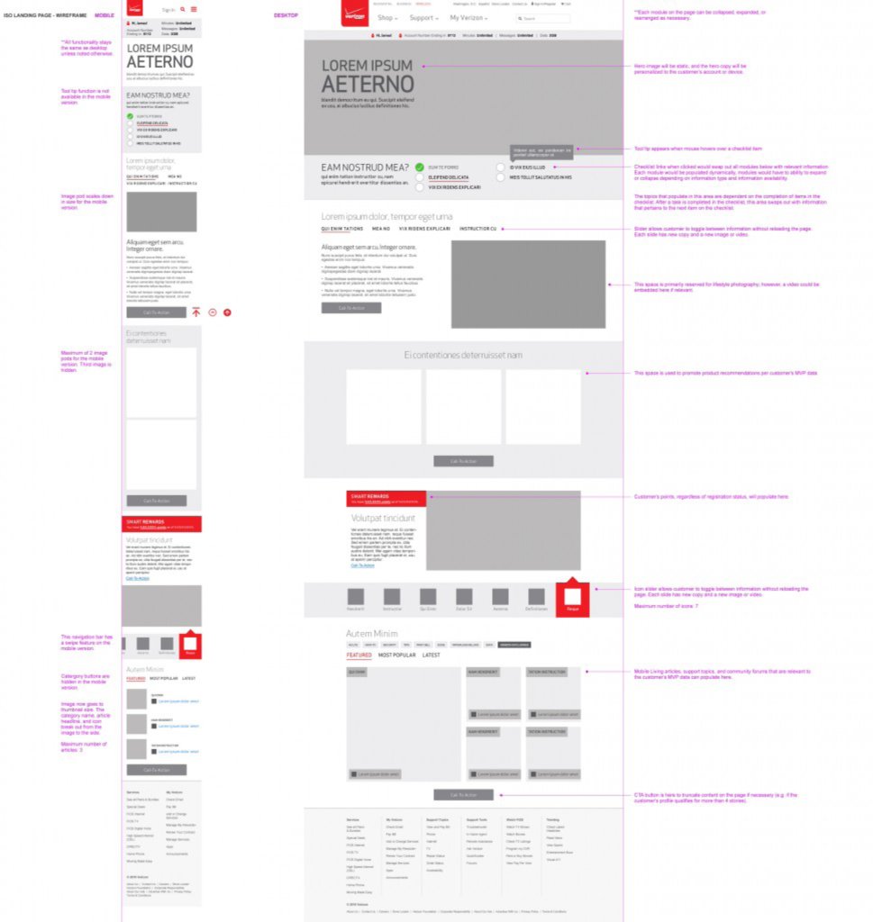
The checklist when clicked would swap out all modules with relevant information. Each modular would be populated dynamically and have the ability to expand and collapse depending on information type and availability.
After the checklist is complete and all actions have been taken the vision is this website would then turn into your own personal landing page for your verizon tenure. Housing relevant information about your account, showing articles that are about your phone, plans, etc. It would become an ever evolving place to get all your info about your account and devices.
Final Design
The Results
14% increase in new customer sign up
5% decrease in call-in rates for onboarding related inquiries