Client
Microsoft Xbox
My Role
UX Design
The Project
On May 21, 2013, Xbox announced the Xbox One. I was on the UX team responsible for the landing page that housed all the information relating to the console, including the live stream of the announcement, specs, images, pre-orders, etc
The Approach
My team and I were responsible for the look and feel of the Xbox One landing page experience. We worked with internal stakeholders on this highly classified project with sensitive material. Designed a flexible framework for the responsive landing page that has the ability to grow and flex with many different layout options. Working alongside the lead designer, we took the designs from stakeholder presentations to wireframes, layouts and finally design specs.
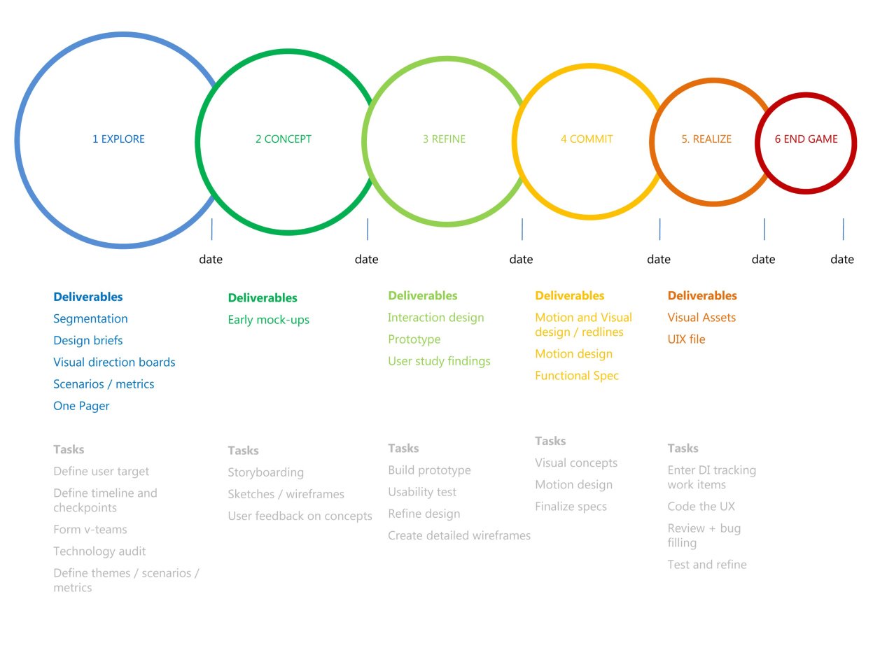
Below is the design process that we set in place for the Xbox team. This assignment was unique in that we had to be flexible with the process. Not having a clear direction or business objectives until closer to launch made the team more fluid in their approach to tasks and milestones.
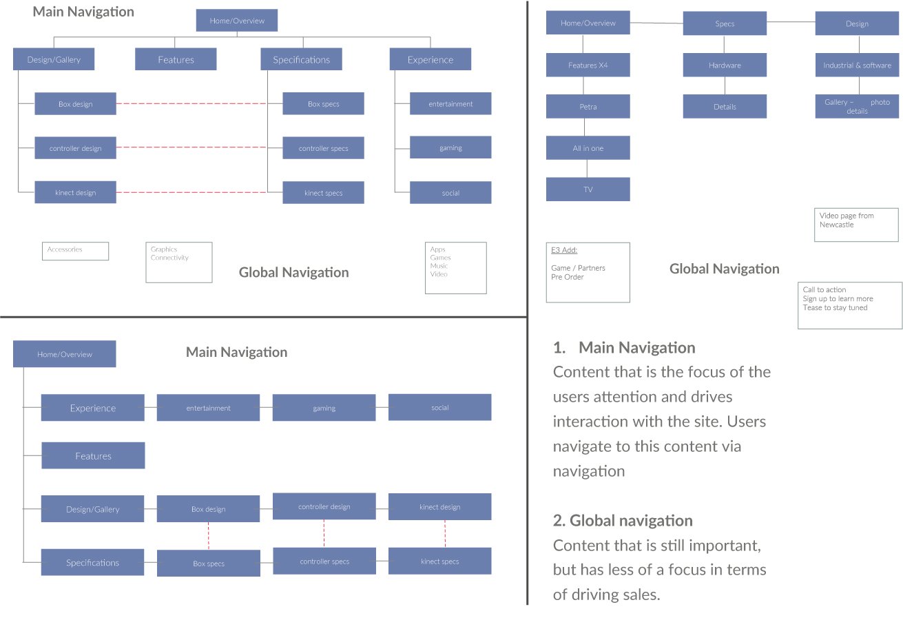
Navigation Structure
We were working under very strict NDA’s (5 to be exact), and not a lot of information was getting released to us in the planning phase of the website. So we took the buckets of navigation we knew we had to have on the site and explored site map structures and information hierarchy.
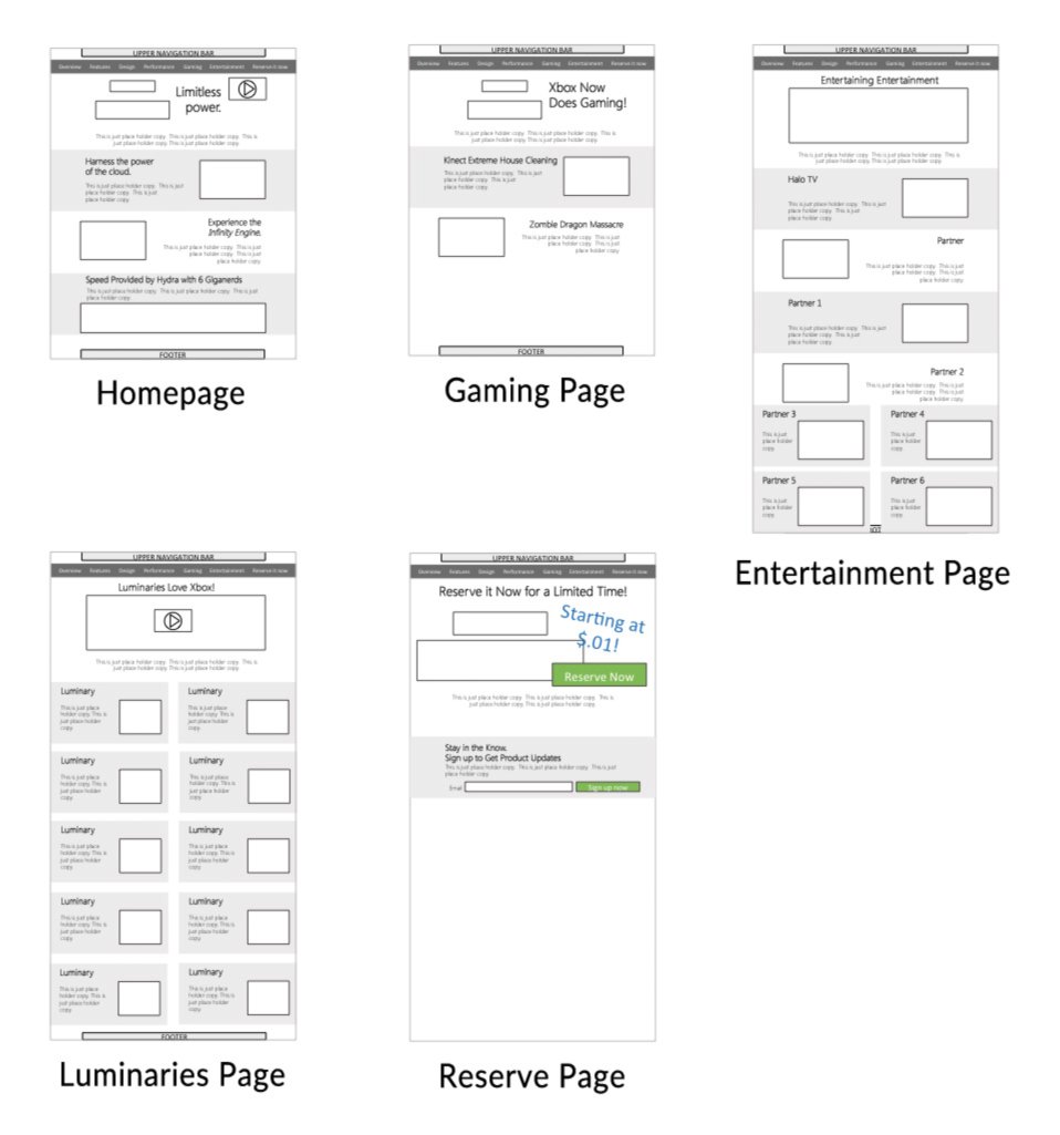
Early Wireframes & Blocking Wireframes
We started with basic wireframes and layout options to show stakeholders and start discussions. Focus features and content was constantly in flux, so we had to be flexible when designing wireframes to be able to accommodate multiple layout options. We also knew that the site had to be responsive, so we set a grid in place that would accommodate a mobile design.
Getting closer to launch (3 months out), we started to wrap the wires with branding colors, fonts, and old visual elements to get a sense of spacing and layout. We weren’t sure how little or how much information we were going to have at launch so we planned for the worst case scenario’s and worked backward.
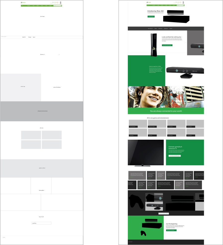
Getting closer to launch, it started to become real. There were several iterations of feature layout options we produced so when the time came to launch we would be ready with options.
High Fidelity Wireframes
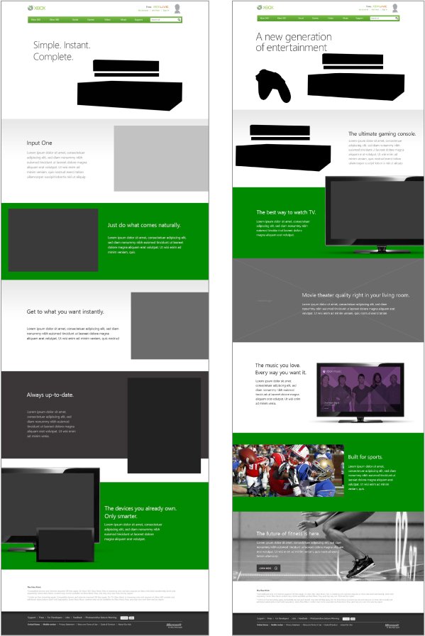
Final Designs & Launch Screens
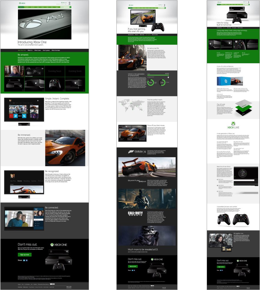
We finally received live screenshots, product shots and feature photography to roll into the final layout. We got final sign off on the layout and live content one week before launch. The multiple iterations we had created made the condensed timeline of the launch easier to handle.
Over a million people watched the live stream of the Xbox One announcement on the website, and it took in more than half a million pre-orders within the first 72 hours. The site turned out to be a success and the UX framework is still in place today with content being updated regularly.