Client
Smartsheet
My Role
UX/UI Design
Web Design
The Project
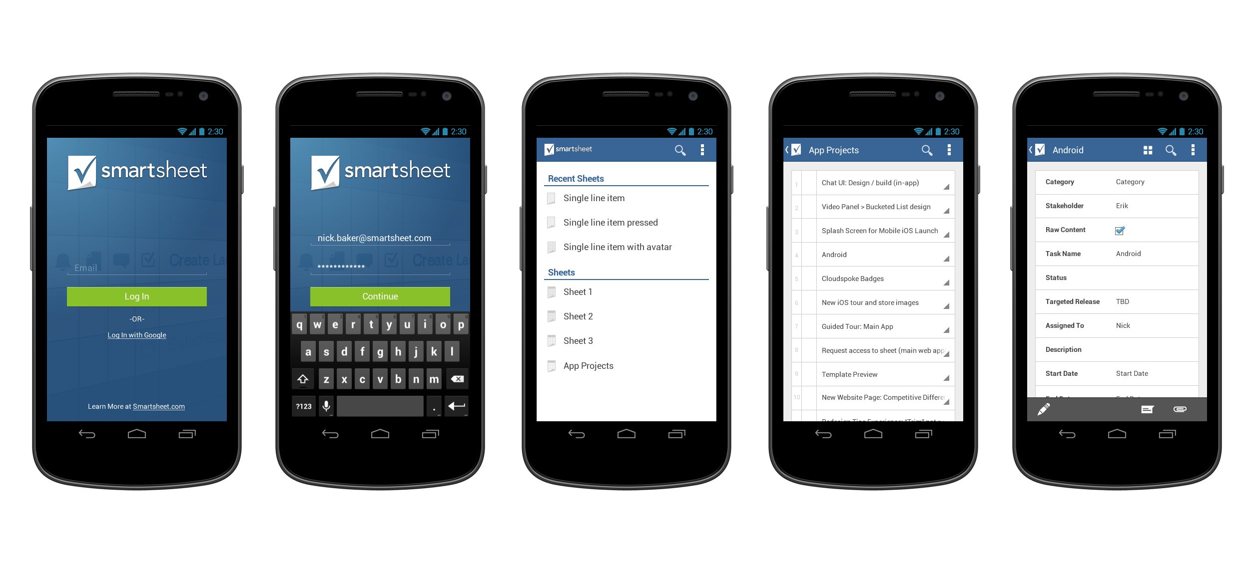
Smartsheet is an application for collaboration and work management. It is used to assign tasks, track project progress, manage calendars, share documents and manage other work. It has a spreadsheet-like user interface. I worked as a senior UX designer, responsible for web and mobile UX. I refreshed the mobile UX/UI for the Android update, taking the designs from conception, wireframing to final polished visuals. I also worked on UX updates for smartsheet.com including Webinars, Training, Templates, and Video Center pages along with other various updates.
The following example is focusing on the login process and first-run experiences either through the Native app, mobile web interface, and desktop web interface.
The Approach
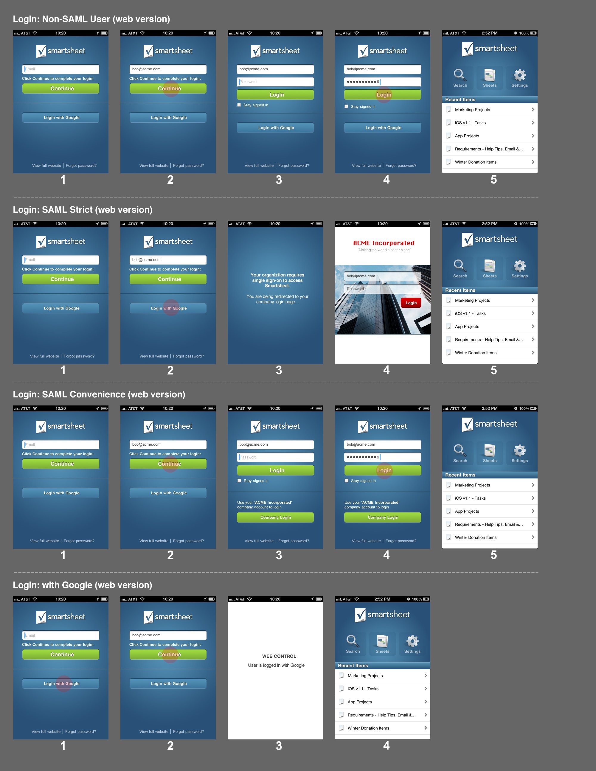
The top priority and goals of this particular project were enhancing the login experience for the mobile free trial and existing user base. The initial mobile sign-in process was convoluted and not well received by our user base when I first joined the team. I took a look at user feedback and conducted user interviews to really find out the pain points and figure out our opportunities for improvement. After gathering the data on the users I continued to map out the entry points and user flows through site mapping. There was another layer of complexity throughout this process with Smartsheet being HIPA certified meaning that we had to deal with SAML (Security Assertion Markup Language) for authentication purposes. I took a very agile approach to this project with many iterations and rounds of reviews to make sure we covered every use-case scenario.

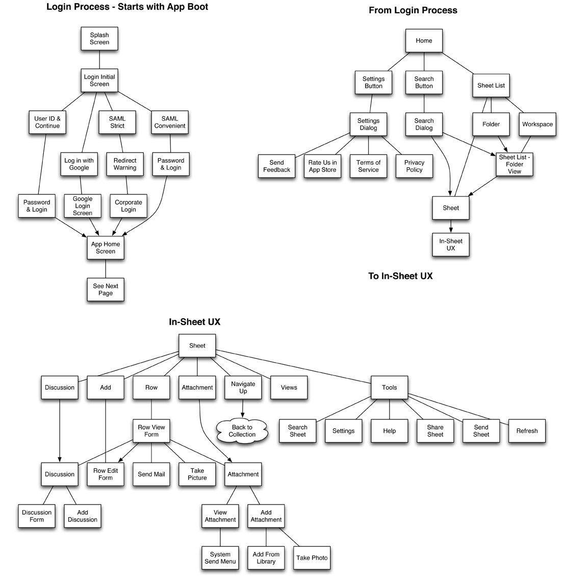
Wireframe Rounds
When it came to wireframing I took a very low-fi iterative approach. I wanted to make sure all the scenarios and use cases were covered before I moved into high-fidelity comps. I created a Balsamiq toolkit for fast UX mockups and then produced screens for sign-off and approval.

We worked under the motto of Users expect it (today). Users will demand it (near future). We were a fast-moving design team that had a lot of screens to design and scenarios to think through in a little amount of time.
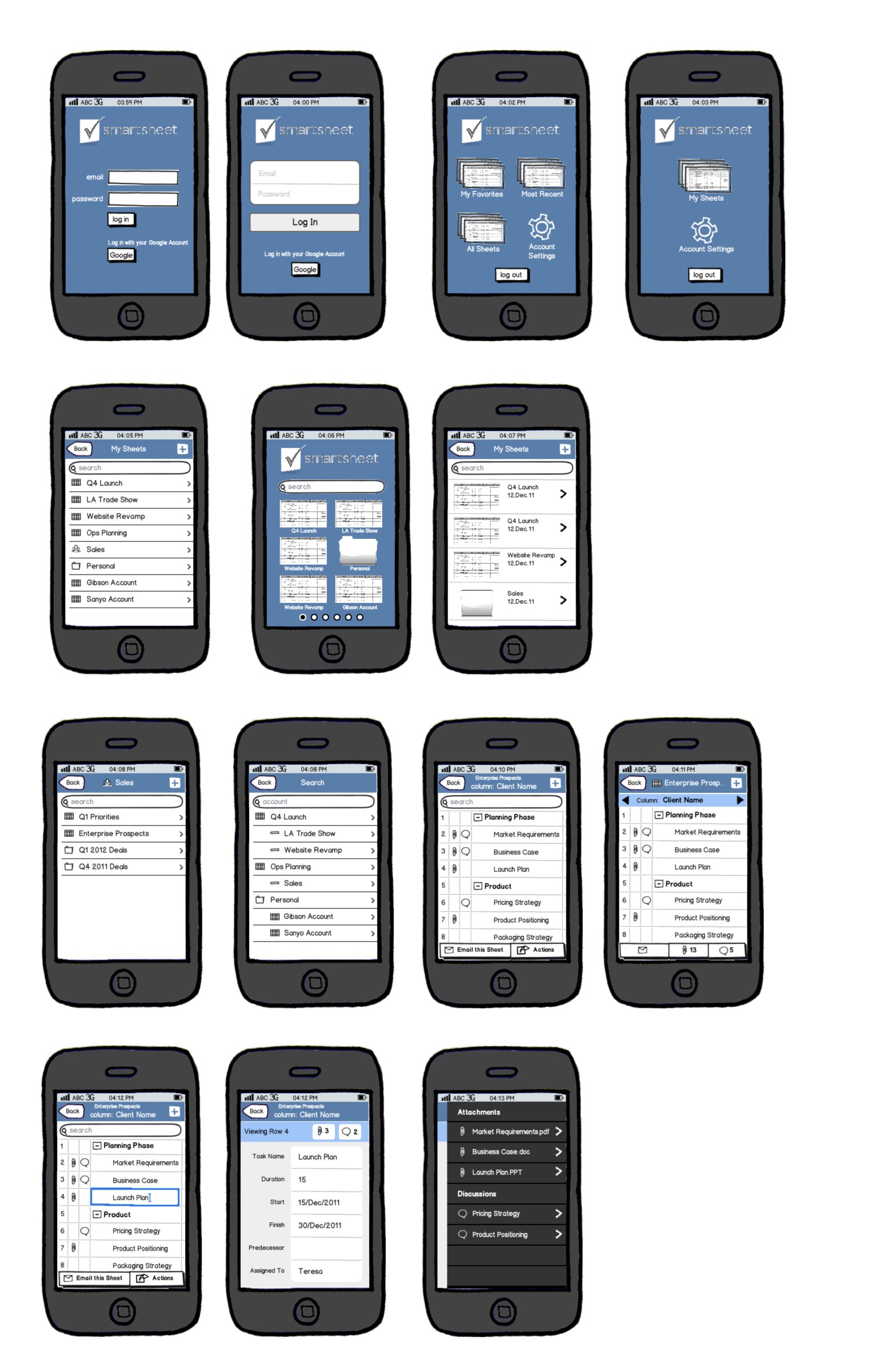
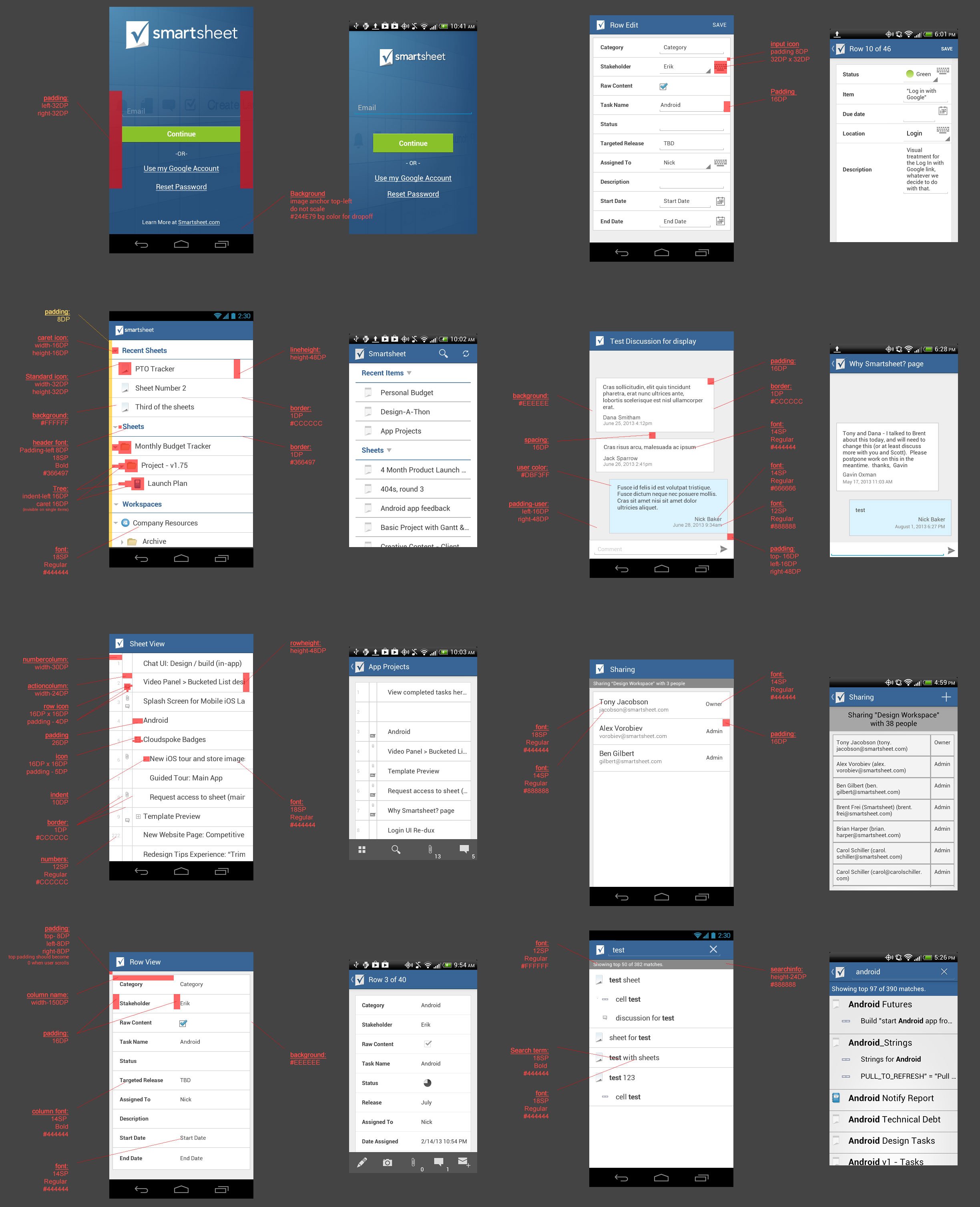
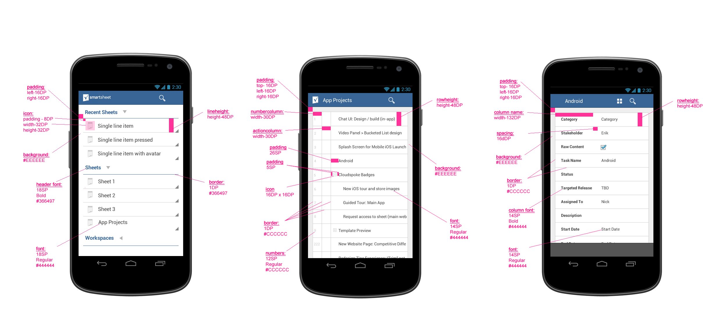
Final Design Comps
Annotations and Design Specs
I worked with the development team to ensure that they had all the annotations and redlines for each screen along with visual assets. I would then follow up and test the screens in their native environment and make sure design QA was satisfied.
The Results
Log-in bounce rates decreased by 20% after the redesign
10% increase in time in-app for Android users after the update
The redesign was followed by an increase in adoption and larger funding rounds.